We redesigned and rebuilt the S/ASH web. A vibrant creative hub reimagining how space is used for collaboration.

Overview
S/ASH is not just a space — it’s a living, breathing creative collective based in Melbourne, Australia. Housed in a reimagined industrial warehouse, S/ASH offers an evolving mix of studio rentals, artist spaces, events, markets, co-working areas, and storage units — all under one roof.
Their audience? A mix of makers, florists, designers, writers, brand builders, and creatives seeking more than just a workspace. S/ASH represents a movement — a space for energy, intention, and experimentation. But despite their strong identity and community, their previous website on Wix didn’t fully reflect the unique essence and fluidity of the brand.
That’s where Hesso came in — to redesign and re-platform S/ASH into something far more dynamic, flexible, and immersive.
The Challenge
The existing S/ASH site had functional limitations and design constraints that didn’t align with the brand’s energy and evolving nature. It lacked:
A cohesive visual language that matched S/ASH's eclectic identity
Flexibility to scale as the collective expanded
A user-friendly structure for showcasing their diverse offerings
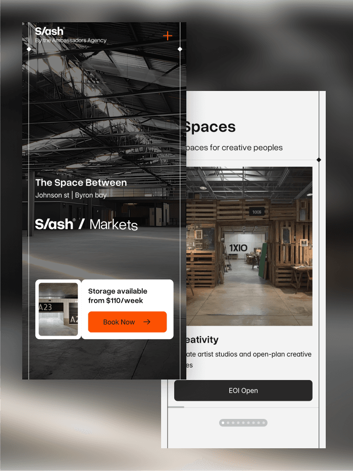
Mobile responsiveness and performance optimization
A compelling storytelling layer that welcomed curiosity
We needed to reimagine the site as a creative portal — one that invites exploration, communicates offerings clearly, and reflects the raw charm of the space itself.
What We Do
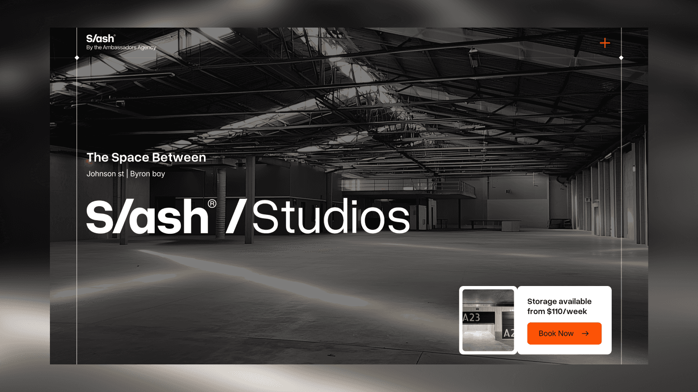
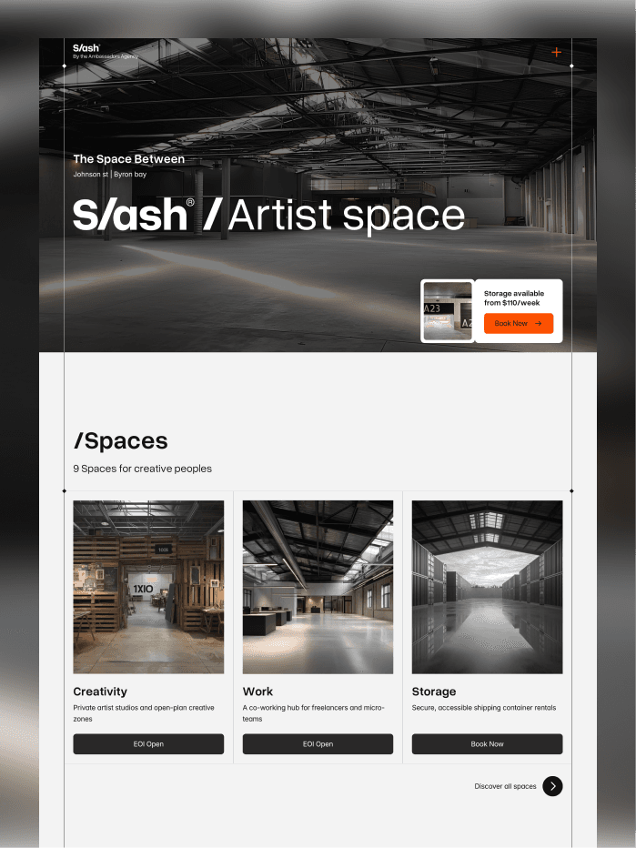
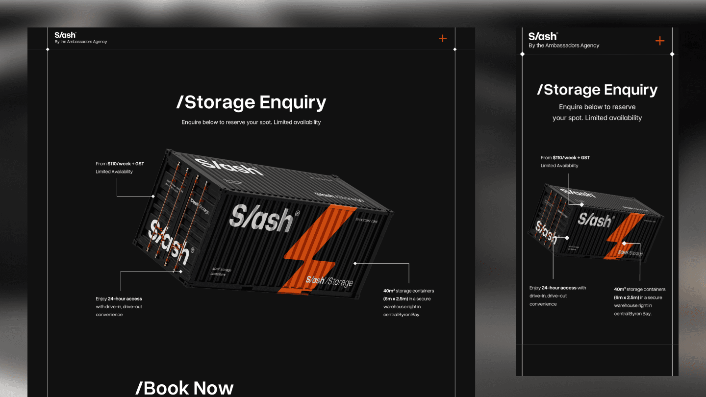
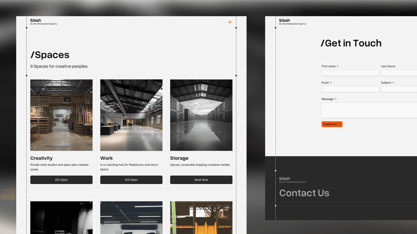
We began by mapping out a new site architecture that could grow with S/ASH — defining clear pathways for visitors to explore Spaces, Events, Studios, Membership, and more. From there, we redesigned the visual system with a bold editorial feel: large type, raw textures, layered imagery, and fluid movement — all mirroring the spirit of the warehouse.
Using Framer, we rebuilt the site from scratch — migrating from Wix to a more powerful and design-forward platform. We also expanded the site with several new sections to support their evolving needs: dedicated pages for artist residencies, venue hire, and market participation. The backend structure was optimized for performance, SEO, and content flexibility, ensuring the team can update and grow the site with ease.
The Result
The new S/ASH website is no longer just a landing page — it’s a living extension of the space itself. The redesign gives users a clear understanding of what S/ASH offers, while leaving room for discovery, community stories, and organic growth.
From the first scroll, the site reflects the collective’s energy: unapologetically creative, slightly gritty, and always in motion. It’s now a tool that attracts the right audience, hosts new opportunities, and gives S/ASH the digital home it deserves.
Jadikan bisnis atau personal brand kamu lebih profesional dan eksklusif
We redesigned and rebuilt the S/ASH web. A vibrant creative hub reimagining how space is used for collaboration.
Overview
S/ASH is not just a space — it’s a living, breathing creative collective based in Melbourne, Australia. Housed in a reimagined industrial warehouse, S/ASH offers an evolving mix of studio rentals, artist spaces, events, markets, co-working areas, and storage units — all under one roof.
Their audience? A mix of makers, florists, designers, writers, brand builders, and creatives seeking more than just a workspace. S/ASH represents a movement — a space for energy, intention, and experimentation. But despite their strong identity and community, their previous website on Wix didn’t fully reflect the unique essence and fluidity of the brand.
That’s where Hesso came in — to redesign and re-platform S/ASH into something far more dynamic, flexible, and immersive.
The Challenge
The existing S/ASH site had functional limitations and design constraints that didn’t align with the brand’s energy and evolving nature. It lacked:
A cohesive visual language that matched S/ASH's eclectic identity
Flexibility to scale as the collective expanded
A user-friendly structure for showcasing their diverse offerings
Mobile responsiveness and performance optimization
A compelling storytelling layer that welcomed curiosity
We needed to reimagine the site as a creative portal — one that invites exploration, communicates offerings clearly, and reflects the raw charm of the space itself.
What We Do
We began by mapping out a new site architecture that could grow with S/ASH — defining clear pathways for visitors to explore Spaces, Events, Studios, Membership, and more. From there, we redesigned the visual system with a bold editorial feel: large type, raw textures, layered imagery, and fluid movement — all mirroring the spirit of the warehouse.
Using Framer, we rebuilt the site from scratch — migrating from Wix to a more powerful and design-forward platform. We also expanded the site with several new sections to support their evolving needs: dedicated pages for artist residencies, venue hire, and market participation. The backend structure was optimized for performance, SEO, and content flexibility, ensuring the team can update and grow the site with ease.
The Result
The new S/ASH website is no longer just a landing page — it’s a living extension of the space itself. The redesign gives users a clear understanding of what S/ASH offers, while leaving room for discovery, community stories, and organic growth.
From the first scroll, the site reflects the collective’s energy: unapologetically creative, slightly gritty, and always in motion. It’s now a tool that attracts the right audience, hosts new opportunities, and gives S/ASH the digital home it deserves.